Context
We all know what it’s like to get our first big paycheck and have our minds go wild with all the material wants and “needs” to fill that proverbial dark and empty void in our lives (don’t let anyone tell you that buying a Ryan Gosling cutout was a bad idea). Well, our vision wasn’t to tell users how to spend their money. Instead, we wanted to provide a resource that gave them more control over it, to create and maintain more awareness of their personal finance goals and to create better spending habits through behavioral modification techniques that they chose.
That’s where our team of two began — Roberto Mendoza and myself. We had 5 weeks allotted to complete this challenge arranged by Brandon Beecroft. Our final designs would be an iOS app that will deliver our solution to our challenge stated above.
Our Process
Building a Creative Brief — Empathize and Define
As eager new students to UX as we were, we couldn’t help but start bouncing different ideas around and getting a bit carried away. Once we settled down and got it out of our systems, we outlined our creative brief and started answering some questions:
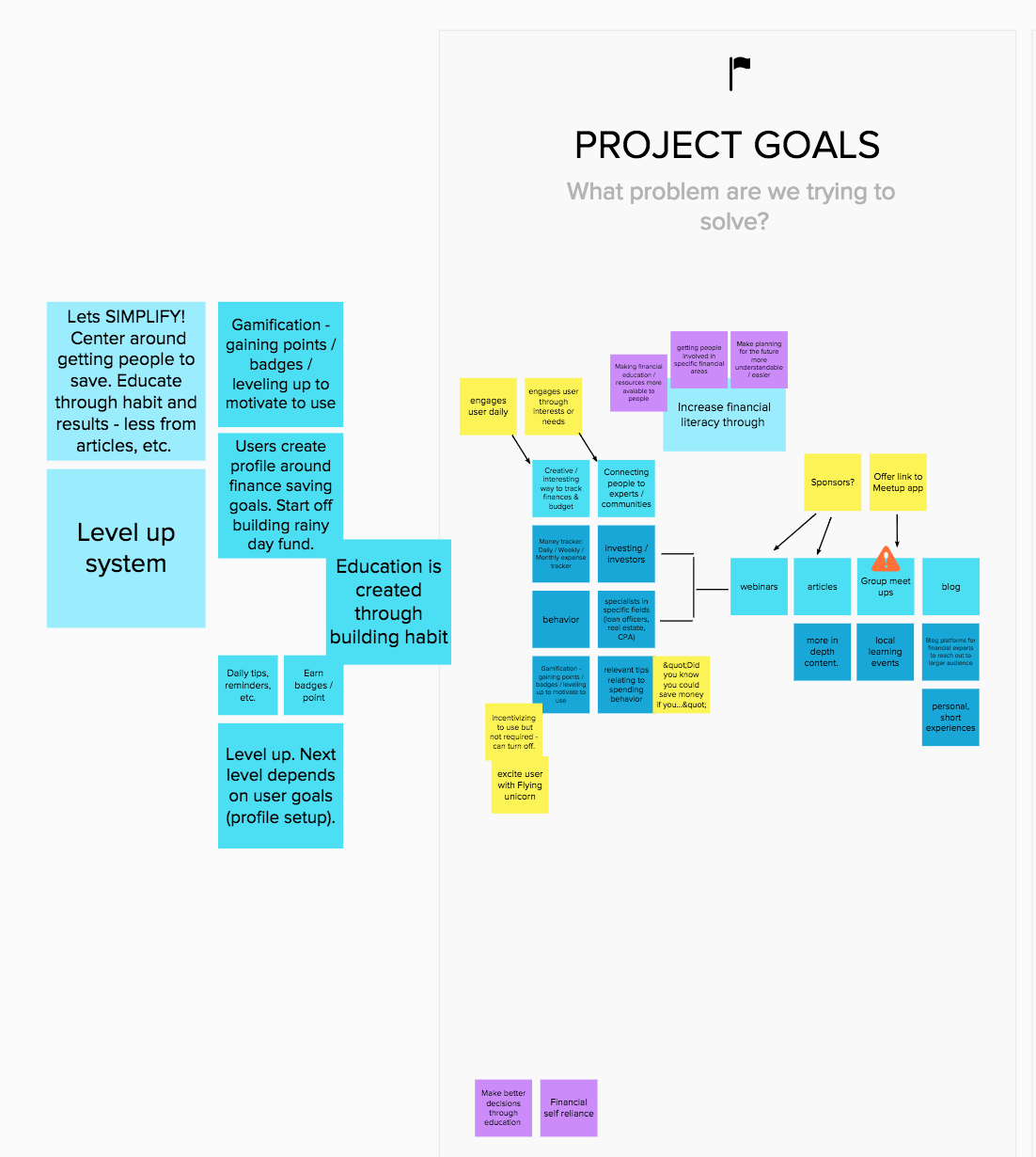
What problem are we trying to solve?
Increase financial literacy through creative and interactive finance tracking, and connecting people to experts/communities through a social platform and articles.What is our key objective?
Early on we agreed our audience would be between the ages of 16 and 30. The idea being that we create confidence with independence with a younger audience to strengthen habits through behavior modification, provide professional tailored resources to answer their questions and top it off with fun, simple incentivized gamification. Ya know, nothing too crazy for two beginners.What is our key message?
Building and maintaining basic financial habits can be easy, accessible, and engaging. Budgeting doesn’t have to prematurely promote you to being a boring adult. It doesn’t have to be a chore!
Information Gathering — Discovery
Now that we answered a few questions to get started down a path, we needed to understand the users more; what did they want from a budget app and what was their current opinions on personal finance.
For the first round of interviews conducted, 5 questions were created that were based around the project goals. These 5 questions would be asked to randoms on the street outside a Chase Bank corporate building with intentions to corner one expert on finances. It became quickly apparent that this was insufficient and several more questions were needed to get an appropriate amount of data. This lead to creating a survey with Google Forms so a larger audience could be reached more quickly. These questions and concerns came about more easily as these are concerns we have as individuals. Personally, I feel this gave a sturdy “empathic foot” to stand on.
The survey was delivered via Facebook and to a few select people in my phone’s contact list and waited for the responses to roll in. Within about 36 hours there were around 60 responses. This data would largely be what is referred to throughout the remainder of the design process.
View the full Financial Survey here.
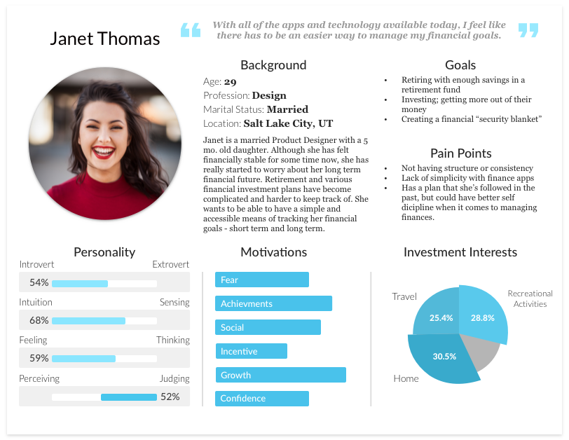
Creating a Persona
The information gathered from the survey was more than enough to craft a strong persona. The first step taken was to gather the more common or related responses and then elaborating on them through the perspective lens of a generated name, “Janet Thomas”. A female persona was chosen because there were more female respondents than males (though, by a very small margin).
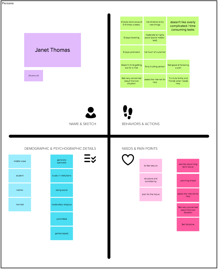
Once there was a sufficient amount of information compiled into the spaces shown above, it was packaged together by dissecting example persona templets and creating a custom design using Sketch.
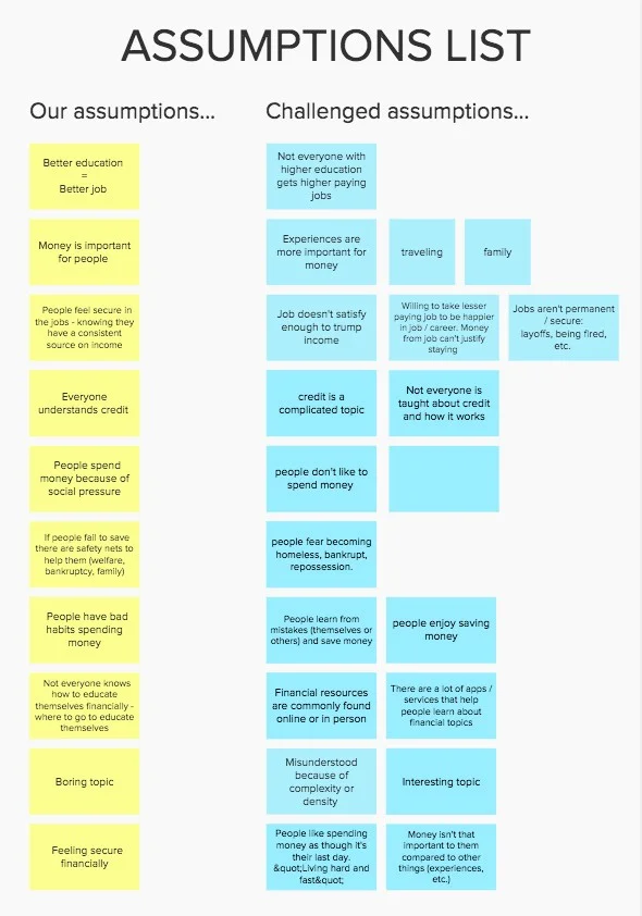
Challenging assumptions — Ideate.
This was a particularly important, or ‘eye-opening’, learning experience as any previous plans and desires that were collaborated on at the beginning of the project were either crushed and swept aside or were slowly devolving and emerging as something simpler and more clearly understood.
Now that the rose-colored glasses were replaced with some much clearer spectacles, giving a more realistic perspective, the next step was taken to challenge assumptions. This strategy helped break out of single-track thinking patterns and “shifted the lens” on previous perspectives. Understanding both sides of the coin reassured the value of an approach or, on the contrary, showed it had no value to the project’s goals.
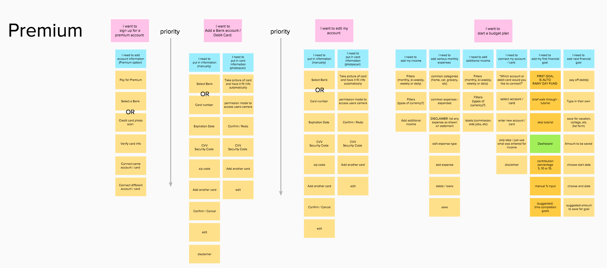
User Story Map — Defining a MVP.
The project had passed the halfway point in the allotted 5 weeks and so time was a major factor as to where the MVP was set. With that consideration, it was important that the app encompass the bulk of the project goals. With less than 2 weeks remaining though, a conclusion had to be drawn to split the product into 2 available options to the user:
A free version where the user will get the basic functionality — input and track income, manage and record expenses and to be able to create and manage financial goals (save for a rainy day, new car, etc.)
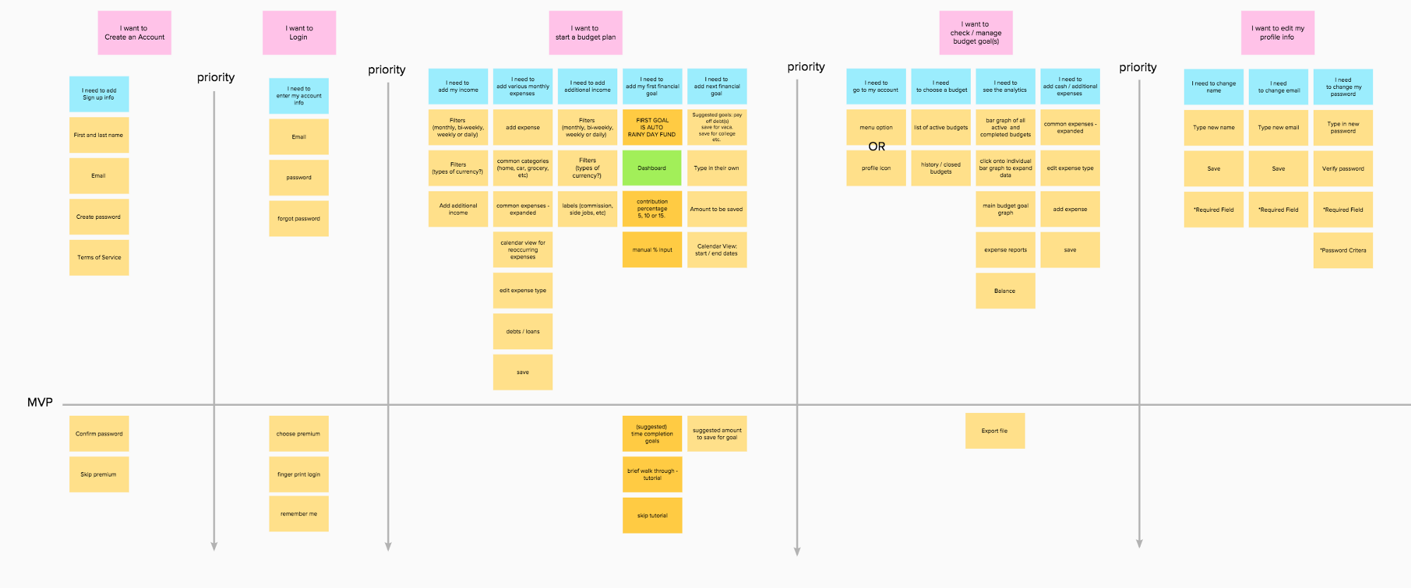
And a paid premium version that is more automated and offers more resource options — auto-track inflow and outflow by connecting your bank account and a portal to connect to experts or specialists.
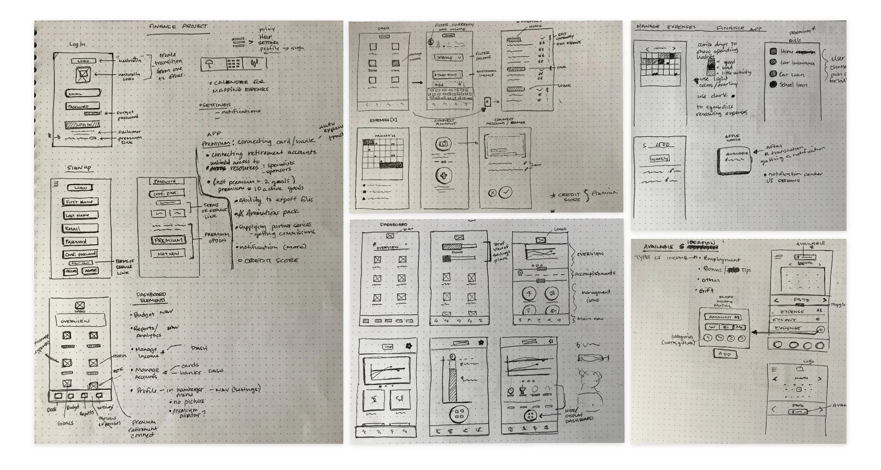
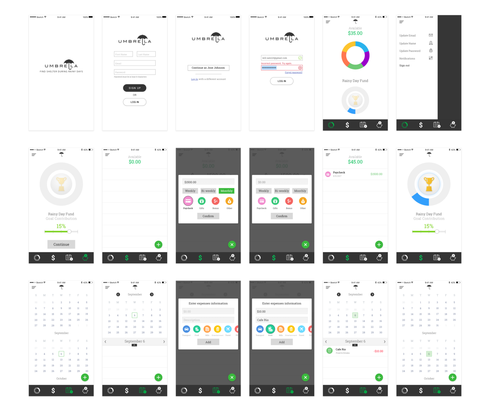
Wireframes
The next couple of days were spent wire framing and ideating over user flows. Anything that wasn’t necessary to the MVP, like logging in with Touch ID, or if it didn’t relate to the free version concept, was cut out.
“Perfection is achieved not when there is nothing more to add, but when there is nothing left to take away”
— Antoine de Saint-Exupery
High Fidelity Mockups
In order to focus on the the goal of creating a tool to develop habits through behavior modification, a fairly minimalistic design approach was used.
In both concepts, gray and green hues and flat material styles were strongly maintained as to not distract from the above stated goal.
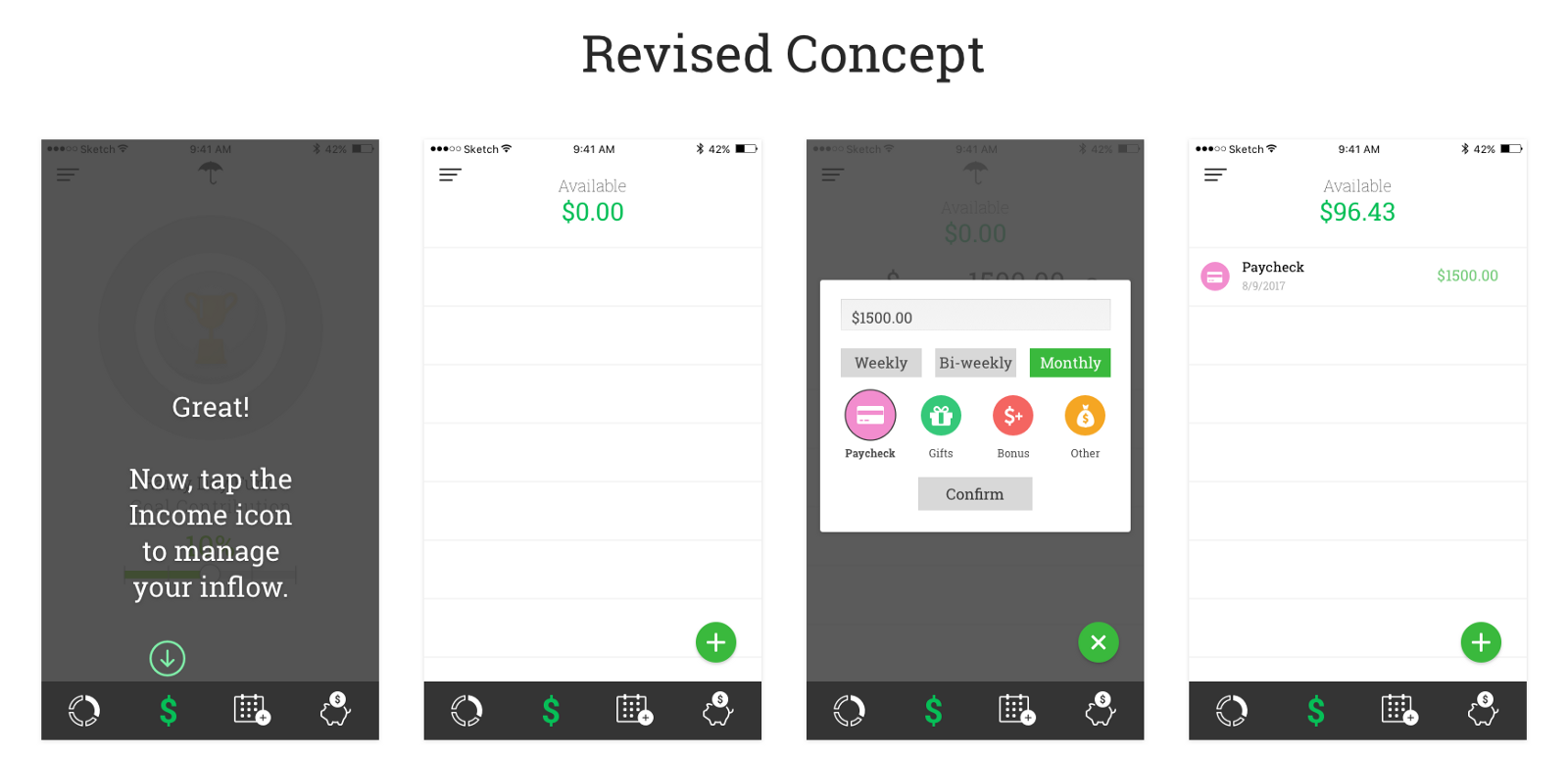
After several user tests a revised concept was designed. Iconography and color was lightly adopted to help make the users input options easier and more intuitive.
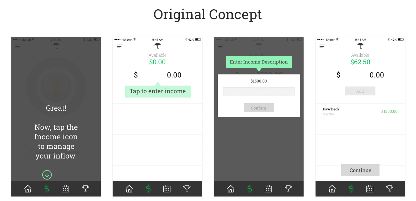
Prototypes & User Testing
Choosing which tool to create the prototype became an immediate hurdle. Several tools were introduced through the bootcamp’s course curriculum — Framer, Principle, Adobe XD and Invision. With the lack of time available and the learning curve involved with each tool, it was narrowed down to Invision after a brief trail with Principle proved to require more steps for a similar result.
For this particular prototype, as another prototype was created showcasing the various interactions between elements and the adaptation to new data entered (this was where more was bitten off than could be chewed since it required duplicating and importing a new screen for every possible instance), a set of 3 scenarios with 3 tasks, one for each scenario, was created. This helped the user understand why certain data was changing to specific values. For example:
Scenario 1
You’ve downloaded this new budgeting app, Umbrella, and you want to sign up to start a ‘rainy day fund’ and save 10% of your income, which is $1500, monthly.
Task 1
Sign up and follow the on-boarding screens to set up a ‘rainy day’ fund.
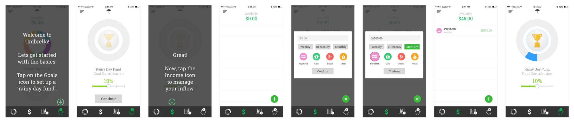
After the user completed this first task, they were asked if they understood why the new values displayed for “Available” had changed. This scenario / task strategy yielded a greater understanding from the users where as the previous prototype, although having a greater interactions experience, left users more confused as to how a value was changed.
Conclusion
For every step in the process there were several key ‘takeaways’ that I grew from as a UX/UI Designer:
Write down every idea, sketch or doodle and cross nothing out. Whichever of those things might not seem to earn any space within the project at its early stages just might later on down the line. Often it would help me elaborate on another element that was relevant to the project’s goals. In the future, these will be great references to jump start creativity, too. Even if it’s unrelated to the project at hand.
The user is always the primary reason to which all the effort goes into solving problems. Anything created outside of that is biased clutter that has large potential to come back and cause issues. This also highlights the importance of understanding who the users are and what their needs are. Gathering that information and applying it to project goals and solutions quickly will be most effective.
Defining the process early will help to save a lot of time rather than risking wasting time using the wrong tools or strategies. I think this is something that becomes more clear and more easily defined with time and experience. Being conscientious of this though will encourage creating a strategy or process earlier rather than later.
Overall,
“Keep it simple, so you’ll keep doing it.”
— Steve Krug